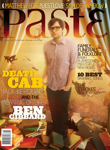
I chose the magazine Paste to model my cover after because I like the overall composition of the image and text and how they all work together. I also like the variety of fonts used, it adds a lot of viewer interest and typographical diversity that isn't always common on magazine covers. The alignment of the article titles are also different and unexpected, like the left justified text in the right most column. I'm not sure if I would be able to pull it off, but it is a good source of inspiration.
No comments:
Post a Comment