Thursday, December 16, 2010
Tuesday, November 30, 2010

Carolina's Website Design Firm/Animal Merge
http://www.cyphondesign.com/web-design.html
I found this website nice and simple in the layout as well as easy to look at. I really thought the coolest part had to do with the 'our work' page in which you could scroll over the links to websites they had done and see a thumbnail as opposed to needing to click on each image to see it. Cool layout, and I like the work they do. :)
Also, me as a Gecko;

Allisons Interactive Design Firm
http://www.studiobanks.com/
This is a firm that provides interactive web design to clients. Looking through their portfolio I saw they did a website for CMA and Billy Graham. There was a variety of clients and all the websites (including their own) were very well designed and interesting to look and navigate around.
This is a firm that provides interactive web design to clients. Looking through their portfolio I saw they did a website for CMA and Billy Graham. There was a variety of clients and all the websites (including their own) were very well designed and interesting to look and navigate around.
Megan's Interactive Design Firm
I picked Big Squid Interactive. First of all I like their name. And the fact that they have a big pink squid on their homepage. They also have a clever slogan: "In a sea of opportunities, THINK BIG. THINK SQUID." They work both with large and small companies, providing internet marketing strategies to boost interaction online.


Kim's interactive webpage and animal face

I chose Creed because they have a very professional website and offer many services. Creed designs the University of Minnesota's websites as well as websites for the Minnesota Wild, Boston Scientific, Minnesota Waters, and more. Their website is designed so it is easy to follow and still looks appealing.

Terri's Interactive Website
http://401creative.com/
I chose 401 Creative because their website was very appealing to me. They are based out of Lehigh Valley, Pa. They have designers, strategists, producers, developers, photographers, producers, and writers whose goal is to develop marketing tools and innovative user experiences. Their website has a very "design-y" background and has pictures rotating with different information about the design group. It's still very easy to navigate, but still has a distinct style.
I chose 401 Creative because their website was very appealing to me. They are based out of Lehigh Valley, Pa. They have designers, strategists, producers, developers, photographers, producers, and writers whose goal is to develop marketing tools and innovative user experiences. Their website has a very "design-y" background and has pictures rotating with different information about the design group. It's still very easy to navigate, but still has a distinct style.

MARI: Interactive Design Website
http://www.juxtinteractive.com/
JUXT is an California interactive design firm housed in both San Francisco and Newport Beach. They offer, according to themselves, "industry leading design coupled with proven interactive strategy and branding." They are a pretty pop-looking firm, even their website is very centered toward younger audiences. This is even more obvious when you scroll through their work, which is displayed on the front page of their website. Their client list includes some of the biggest companies in the United States: Target, Coca Cola, Walmart, Sony, General Mills, and even our treasured Adobe. Overall, I love their style. One cool feature that they included on their own website is the shuffling of the background image. Each page is not adhered to a certain background; instead, as you revisit it, it recycles through a multitude of interesting illustrations.
JUXT is an California interactive design firm housed in both San Francisco and Newport Beach. They offer, according to themselves, "industry leading design coupled with proven interactive strategy and branding." They are a pretty pop-looking firm, even their website is very centered toward younger audiences. This is even more obvious when you scroll through their work, which is displayed on the front page of their website. Their client list includes some of the biggest companies in the United States: Target, Coca Cola, Walmart, Sony, General Mills, and even our treasured Adobe. Overall, I love their style. One cool feature that they included on their own website is the shuffling of the background image. Each page is not adhered to a certain background; instead, as you revisit it, it recycles through a multitude of interesting illustrations.
Liz's Interactive Design Firm
http://flooidinteractive.com/
FlooiD Interactive is an interactive design firm that specializes in versatile and innovative web solutions, social media marketing and creating logos. They mainly do work for websites of hotel chains, restaurants, and special event clubs. Their designs are ritzy and flashy. I notice a lot of gradients going on in their logos, a little too much if you ask me. Despite some of their work being a little over the top, I do think that they are visually appealing and definitely grabbed my attention. They incorporated a lot of graphics in their website, which was a little irritating at first but then you realize that’s the whole point of their website.
Matthew's interactive design firm
www.razorfish.com
I chose razorfish a interactive design firm from Seattle, Washington. They do some good stuff, I think the main page is a little much but it definitely shows off what they can do. The movement of the background is rather interesting. They have done work for some really large companies. Their style is different in everything they do, not a cookie cutter type of company where everything is the same. One thing is their site takes awhile to load which might be an issue with people with slower internet connections.
Lizz's Interactive Design Firm
http://www.creativearc.com/
So, the design firm that I found is called CreativeArc. I chose them for a few reasons, the first being that they're a local company, based out of Minneapolis. They also do a alot of work for local businesses & schools, which I think is something that would be great to get into, to help out the local community. In addition to local work, they also do websites for non-profit organizations nationwide. Their websites are very simple, nothing too spectacular design-wise. But they are extremely well laid-out, and easy to read and navigate, which I find more practical than something flashy in a lot of cases.
So, the design firm that I found is called CreativeArc. I chose them for a few reasons, the first being that they're a local company, based out of Minneapolis. They also do a alot of work for local businesses & schools, which I think is something that would be great to get into, to help out the local community. In addition to local work, they also do websites for non-profit organizations nationwide. Their websites are very simple, nothing too spectacular design-wise. But they are extremely well laid-out, and easy to read and navigate, which I find more practical than something flashy in a lot of cases.
Monday, November 29, 2010
Connor's Interactive Design Site!!
The firm that I found is called Band Digital . The reason I chose this site was because of its attention to its own site and the pleasing/creative nature of it. In the home page they instantly establish that they are an interactive web design company with two fun little scroll menus that mix and match words together create interesting definitions. The main goal that the group has is to provide a Branding service to other companies. They have a four different locations in the US and do work for a plethora of big name companies, including: Harley Davidson, Mountain Dew, Lucasarts, Sears, and many more! Cool company! Source for the website is crazy, it all looks like gibberish to me!


Justin's cheesy interactive site
http://www.webmediainteractive.com/home.html
their website is trash. this company is a web design site, but in the bottom left corner thanking you for visiting it has extra spaces that should not be there also several other basic mistakes.
http://www.modernista.com/#
is a much more interesting design company but they do a lot more then just websites. they are suppose to be one of the best design agencies. i personally think they change their own stuff to much. they keep making more and more outrageous websites for themselves almost every year. when i first heard of them in 2005 they had a very dark spooky emo look it. in 2006-08 they had on in maintenance that was only a 3 page website with a red bar infront of the standard google search page. In 2009 it was changed as well, and now here is there newest version.
Sarah's Interactive Design Firm
http://www.juxtinteractive.com/
I found this interactive design firm out of California called JUXT. They do a lot of work with big companies like Coca Cola, American Airlines, BMW, and even Adobe. Here is an example of their work for Adobe. Overall, I find their work really diverse and visually interesting to look at. I feel a little overwhelmed when looking at their own website, however. I'm a fan of simple design and the site is a little too over the top for me.
I found this interactive design firm out of California called JUXT. They do a lot of work with big companies like Coca Cola, American Airlines, BMW, and even Adobe. Here is an example of their work for Adobe. Overall, I find their work really diverse and visually interesting to look at. I feel a little overwhelmed when looking at their own website, however. I'm a fan of simple design and the site is a little too over the top for me.


Andrea's Interactive Firm Post
Catalyst Studios is a Minneapolis-based interactive design firm. Their main client is Target, but Best Buy and Kohl's are other major clients. I like their work for other people, but I think their own website is lacking. Many parts need to load and there are so many moving parts, I find it hard to focus on other aspects of the design.
Sunday, November 28, 2010


Kayla's interactive website
http://www.marcecko.com
This is the website for the Ecko brand and it is really fun to navigate around and has a lot of animation and motion throughout. Everything you click on or anywhere you move your mouse causes a reaction from the website. They also have a lot of cool products and different layouts for each section of the site. Enjoy!
This is the website for the Ecko brand and it is really fun to navigate around and has a lot of animation and motion throughout. Everything you click on or anywhere you move your mouse causes a reaction from the website. They also have a lot of cool products and different layouts for each section of the site. Enjoy!
Friday, November 26, 2010

Wednesday, November 24, 2010

Tuesday, November 23, 2010
Bailey Design Firm Website
http://www.oco.com/
Last year I had a chance to meet some people who worked at Olson Design in Minneapolis. I like their website design because it seems like it is always moving and is interactive. I really like the colors for their brand, they are some of my favorite colors. I like how on the home page it has this movement for the main articles/projects like they are flash cards or something. I like how they include a news feed of events and snippets from their blog towards the bottom of the home page. Its not a crazy over the top design, but I think it looks professional and clean.
Last year I had a chance to meet some people who worked at Olson Design in Minneapolis. I like their website design because it seems like it is always moving and is interactive. I really like the colors for their brand, they are some of my favorite colors. I like how on the home page it has this movement for the main articles/projects like they are flash cards or something. I like how they include a news feed of events and snippets from their blog towards the bottom of the home page. Its not a crazy over the top design, but I think it looks professional and clean.
Kim's Design firm website
MARI: Design Website
mono
www.mono-1.com/
mono is a Minneapolis-based design firm that believes in the strength and effectiveness of simplicity. Even their headquarters is very simple - the building is basically a large room divided by room dividers. The space is clean and white and straightforward - much like their designs, as they like to stress. Hence, the simplicity of their website. Despite this, however, I find it to be interesting. It reminds me almost of a white canvas tempting me to see something or think of something or to create something interesting on it - like a challenge.
Megan's Design Firm
www.upshiftcreative.com
Upshift Creative Group is a firm in Chicago that does branding, advertising, and graphic design. Their clients include Weber Grill, United Airlines, Allstate, and Discover Card.
Upshift Creative Group is a firm in Chicago that does branding, advertising, and graphic design. Their clients include Weber Grill, United Airlines, Allstate, and Discover Card.
Matthew's Design website
www.de-facto.com
Besides designing one of my favorite bands website "The Specials", De Facto Design is a multipurpose design firm located in england. They do much more than just websites, their print work is amazing. The level of polish on everything they do is the reason I chose this firm. Awesome all around.
Besides designing one of my favorite bands website "The Specials", De Facto Design is a multipurpose design firm located in england. They do much more than just websites, their print work is amazing. The level of polish on everything they do is the reason I chose this firm. Awesome all around.
Liz's Design Firm
http://www.madadesign.com/
Mada Design Inc is a graphic design firm located in the heart of New York City. This company employs over 50 artists, designers and technicians who collaborate to create innovative portfolios. This company specializes in marketing materials, packaging, logo design, corporate and brand identity and advertising. So basically this company designs for big shot companies who need a visual identity. Looking through their portfolio, I could immediately tell that this company mass produces their designs, but at the same time each design and theme are so different from one another, this must be due to the fact that they have over 50 different people creating the designs.
Mada Design Inc is a graphic design firm located in the heart of New York City. This company employs over 50 artists, designers and technicians who collaborate to create innovative portfolios. This company specializes in marketing materials, packaging, logo design, corporate and brand identity and advertising. So basically this company designs for big shot companies who need a visual identity. Looking through their portfolio, I could immediately tell that this company mass produces their designs, but at the same time each design and theme are so different from one another, this must be due to the fact that they have over 50 different people creating the designs.
Monday, November 22, 2010
Connor's Design Firm Website
I posted a site of a design firm that is called Duffy & Partners. My reasons for choosing this site/firm was do to the quality of their work, they are based in Minneapolis, and I love the variety of their work. They have done mainly the branding work but they're work ranges all the way over to concept work for interior spaces. I have also had the good fortune of meeting one of the partners of the firm and getting a small tour and "interview" of sorts. I would consider this tour to attribute to the reason why I chose to get into graphic design in the first place.
http://www.duffy.com
http://www.duffy.com
Lizz's Design Website
http://www.visual-editions.com/about-us/what
I chose Visual Editions as my design website to post here. They're a firm that specializes in re-designing and re-discovering intriguing ways to look at print media, specifically books. They work with type, obviously, which is something I find extremely interesting, as well as doing covers and identity campaigns for books. They also dabble in some web design, videos, and other print media, but their focus on books is what really draws me to them.
I chose Visual Editions as my design website to post here. They're a firm that specializes in re-designing and re-discovering intriguing ways to look at print media, specifically books. They work with type, obviously, which is something I find extremely interesting, as well as doing covers and identity campaigns for books. They also dabble in some web design, videos, and other print media, but their focus on books is what really draws me to them.
Sunday, November 21, 2010
Allison Design Firm
http://www.firstsightcreative.com/
This isn't exactly a design firm, but this is a kind of designing that I hope to do some day. I really want to do some kind of designing for weddings or parties and ultimately open up my own business. This website specifically is stationary, but I want to help with the decorations, organization, and other things that weddings include. Also, it's a really neat, crisp, and easy to navigate website.
This isn't exactly a design firm, but this is a kind of designing that I hope to do some day. I really want to do some kind of designing for weddings or parties and ultimately open up my own business. This website specifically is stationary, but I want to help with the decorations, organization, and other things that weddings include. Also, it's a really neat, crisp, and easy to navigate website.
Andrea's Firm Website
Eight Hour Day is the design firm of husband and wife, Nathan Strandberg and Katie Kirk. Their focus is pretty broad, ranging from websites to illustrations. Their clients include Target, the Walker Art Center, and the Minnesota Orchestra. They're style tends to be more retro. Though it doesn't give their background on their website, I've heard they're both alumni. I think their website design is successful, as it's easy to navigate and reflects the aesthetic of their firm.
Justin's Design Firm Website
frog design
frog design is my favorite design firm because of three reasons first their unique designs, solutions for every business they take on and their blog. my favorite thing about them is that the blog has so much deign input not just from frog but they have a community of bloggers on it to reply with there ideas and thoughts on a variety of subjects. Just recently on the blog was a discussion about the Ted Talk on NOV 7th. frog design was invited to make some innovations with Ted Talks: http://designmind.frogdesign.com/blog/re-framing-in-london.html .
frog design is my favorite design firm because of three reasons first their unique designs, solutions for every business they take on and their blog. my favorite thing about them is that the blog has so much deign input not just from frog but they have a community of bloggers on it to reply with there ideas and thoughts on a variety of subjects. Just recently on the blog was a discussion about the Ted Talk on NOV 7th. frog design was invited to make some innovations with Ted Talks: http://designmind.frogdesign.com/blog/re-framing-in-london.html .
Thursday, November 18, 2010
Kayla's Design Firm website
http://www.greenleafmedia.com
I found this design website for Greenleaf Media which is a firm that offers tons of "creative services" such as web design, photography, ad campaigns, packaging, logo and print design, and brand identity. The things in their portfolio are really professional and I like the style. Unfortunately the website layout isn't that impressive to me, but it is simple, easy to navigate and gives potential customers a good idea of what the designers there are capable of. I love the variety of what this firm has to offer and would love to work at a place like this if I got the opportunity.
I found this design website for Greenleaf Media which is a firm that offers tons of "creative services" such as web design, photography, ad campaigns, packaging, logo and print design, and brand identity. The things in their portfolio are really professional and I like the style. Unfortunately the website layout isn't that impressive to me, but it is simple, easy to navigate and gives potential customers a good idea of what the designers there are capable of. I love the variety of what this firm has to offer and would love to work at a place like this if I got the opportunity.
Wednesday, November 17, 2010
Terri's Design Firm Website
http://www.larsen.com/
I couldn't get the link to work, but there's the address. I picked Larsen design group from Minneapolis. During my Exploring Careers in Design class they were one of the companies that I contacted about getting and informational interview with. I didn't actually talk to anyone face-to-face, but I emailed one of the designers. I really like their website. It's very interactive, which is something that I like. I also love the simplicity that they incorporate. They do work for a lot of big name companies, such as: 3M, Citi, Target, and the U. They also work with smaller businesses around the Minneapolis area.
I couldn't get the link to work, but there's the address. I picked Larsen design group from Minneapolis. During my Exploring Careers in Design class they were one of the companies that I contacted about getting and informational interview with. I didn't actually talk to anyone face-to-face, but I emailed one of the designers. I really like their website. It's very interactive, which is something that I like. I also love the simplicity that they incorporate. They do work for a lot of big name companies, such as: 3M, Citi, Target, and the U. They also work with smaller businesses around the Minneapolis area.
Tuesday, November 16, 2010
Sam's Design Firm Website
http://mono-1.com/#about
The design firm website I chose if for Mono, which is a design firm in Minneapolis. Last year I was able to visit this design firm as part of a tour through CDES. I really like the simplicity of all their work and think that their website accomplishes this idea as well. In general they just do really cool stuff for major companies such as Apple, Herman-Miller, General Mills, etc. I would enjoy working for a design firm such as Mono for many different reasons from the work environment to the type of clients they design for.
The design firm website I chose if for Mono, which is a design firm in Minneapolis. Last year I was able to visit this design firm as part of a tour through CDES. I really like the simplicity of all their work and think that their website accomplishes this idea as well. In general they just do really cool stuff for major companies such as Apple, Herman-Miller, General Mills, etc. I would enjoy working for a design firm such as Mono for many different reasons from the work environment to the type of clients they design for.
Sarah's Design Firm
I'm trying to post the link but its not working :( So here's the address, use those command+c and command+z skills!
http://www.sevnthsin.com/
The design firm I chose to share is Sevnthsin, a Minneapolis-based firm that I was able to visit and tour last semester through CDes. I was really drawn to this agency because of their laid-back attitudes and interesting design work. By looking at their website you are able to pick up on the sarcastic and goofiness of the staff and firm, which is a quality I would definitely want in a work place. How many firms have a section of their website devoted to office doodles? Their client list is insanely impressive too, which includes everyone from Target to Caribou, and yes, even Pabst Blue Ribbon.
Sam's 2nd Animation
For my second animation I chose the movie trailer for Finding Nemo. Although I don't plan on creating a Pixar-quality animation, I chose this because I'm doing the Rainbow Fish and wanted to see how fish can be animated.
Kim's Second animation
seconds 28-38-- I like the look of the sketched words and the pages flipping.
http://www.youtube.com/watch?v=0cB-LzzDGig
http://www.youtube.com/watch?v=0cB-LzzDGig
Megan's 2nd Animation
This is similar to what mine will be because it's stop motion done with toys. And it's awesome.
Connor's second Animation
This one isn't very close to what I was hoping to portray but it is an insane stop motion example... I had to look high and low for this! Watch it!
http://www.vimeo.com/5214935 (you'll have to copy and paste this into the URL)
Enjoy!
http://www.vimeo.com/5214935 (you'll have to copy and paste this into the URL)
Enjoy!
Allisons 2nd Animation
I chose this animation because it has the same properties and mechanics as the animation I plan on making. Clay and stop motion is how I am going to go about creating my animation and I plan on changing the characters arm motions and mouth movements similar to this video. I also want to create different angles on the characters similar to a real movie like this example did.
Matt's Second Animation
I chose this animation as this is the style I am going after. I really like using paper to make things. This animation is not elaborate, but it definitely has movement and looks like something I could accomplish. Nice little story too.
Sarah's 2nd Animation
I found this animation after looking for something black and white with a hand-sketched quality to it. I would like my animation to be similar to this one in respect to the grayscale scheme and line quality, but I also like the idea that the back ground stays in one place while the figures move around within it. It seems simple enough for a Flash rookie like myself, but also interesting enough that it keeps you watching.
MARI: Similar Animation
I found this while I was skimming youtube for some animation examples - right after we got the flash assignment. I love the simplicity of the drawing style and the straightforwardness of the story. It's humorous and simple and very charming. I want to incorporate that simplicity into my own flash by adopting this sort of lineart drawing style. This would also fit my story because of the antique essence of most Brothers Grimm tales. When I think of the many stories, I usually imagine them in drawings (old-style, Victorian-esque drawings).
Lizz's Second Animation
I chose this animation because it's pretty similar to the style I would ultimately like my animation to be in, though I realize that this is a commerical of sorts. I'm going for a very child-like style, something that's bright and full of colors, which this animation is. I also like the almost choppy quality of the animation, like it's figures being moved around the plane, not moving themselves. My characters would also be similar, short, sort of stout children for the most part.
Monday, November 15, 2010
Terri's Second Animation
http://vimeo.com/4412391
I picked this animation because it has some similar aspects that I would like to have in my animation. Although the drawings are a lot simpler than what I am aiming for, the idea of bringing color into a black and white world is something that I wanted to incorporate. Another similarity this video has with what I would like to do, is that the craziness in this video keeps building on, and that's what happens in "If You Give A Mouse A Cookie." The plot just builds up on top of previous events.
I picked this animation because it has some similar aspects that I would like to have in my animation. Although the drawings are a lot simpler than what I am aiming for, the idea of bringing color into a black and white world is something that I wanted to incorporate. Another similarity this video has with what I would like to do, is that the craziness in this video keeps building on, and that's what happens in "If You Give A Mouse A Cookie." The plot just builds up on top of previous events.
Liz's second animation
http://www.youtube.com/watch?v=daBq278GJlc
Although I plan on making a chase cene for my video, this is far more intricate and complicated than what plan on doing. I like this video for it’s creepiness as well for its “psychadelic-ness”. It basically takes place in a geometric land of optical illusions and its visually stunning to watch. The motion of the characters running is similar to what I wish to incorporate into my video, for it zooms in as well as films from different angles in a single scene. I really like the color scheme incorporated into this video, all of the colors are very bold and are paired in somewhat uncomfortable combinations, like I found the red and purple carpet to be very disturbing. There were also a few scenes that were just in black and white.
Although I plan on making a chase cene for my video, this is far more intricate and complicated than what plan on doing. I like this video for it’s creepiness as well for its “psychadelic-ness”. It basically takes place in a geometric land of optical illusions and its visually stunning to watch. The motion of the characters running is similar to what I wish to incorporate into my video, for it zooms in as well as films from different angles in a single scene. I really like the color scheme incorporated into this video, all of the colors are very bold and are paired in somewhat uncomfortable combinations, like I found the red and purple carpet to be very disturbing. There were also a few scenes that were just in black and white.
Bailey 2nd Animation
I stumbled upon this stop motion video and I really liked it. I'm going to do stop motion with people for my project, in a similar manner to this video. I was planning on doing a scene in a bed for a small portion of it, so it's nice to see the way that this person directed it. I think this video is really creative, it's a really interesting way of communicating ideas. I'll definitely use this as a source of inspiration for my project.
Sunday, November 14, 2010
Kayla's 2nd animation
This video is one of my favorite animations because of the dramatic color, lighting and smoke effects. I would really like to incorporate some of these elements into my animation as well. The glowing colors and high contrast with the black silhouette shapes make this video really interesting, and hard to look away from. I also like how smooth all the camera angles and transitions are.
Andrea's 2nd Animation Post
I just watched Fantastic Mr. Fox for the first time last night and thought it was an excellent example of stop motion animation. I'm not currently planning on trying stop motion, but I do want to use elements and textures from nature, as the creators of Fantastic Mr. Fox did. The movie feels so fun and authentic due to the variety of real-world textures.
Wednesday, November 10, 2010
Connor's Animation
The first link that I posted above is actually a stop motion video that I have watched for years now. The massive number of frames that the creators put in make the movie almost seamlessly fluid. The trick of stop motion creates the illusion of ordinary objects (this case kitchen utensils) move on their own accord. And so in case the stop motion movie doesn't fit the bill for this blog, I also included another link that will bring you to an animation about a defective robot that ends up fighting for his loose hand with another defective robot. I liked this video in particular because of its concept sketches included in the credits at the end.
Bailey Animation
http://www.youtube.com/watch?v=A7F2X3rSSCU
I picked this video for a couple of reasons. First of all I really like the song, plus it was the song I chose for my album cover. It is from the Beatles movie "Yellow Submarine" and it came out in 1968. I really like the illustration style of this video, it is colorful and has a hand-drawn quality to it. I like that the illustrator managed to capture the essence of each character without being super realistic. The animation really goes well with the flow of the song, and it's psychedelic feel really puts you in a certain mindset. Even as an older example of animation, it is still pretty cool and very successful. I'm hoping that my project will have similar qualities to this video, I would like to use bright colors, have a hand-drawn style, and have my illustration flow really well.
I picked this video for a couple of reasons. First of all I really like the song, plus it was the song I chose for my album cover. It is from the Beatles movie "Yellow Submarine" and it came out in 1968. I really like the illustration style of this video, it is colorful and has a hand-drawn quality to it. I like that the illustrator managed to capture the essence of each character without being super realistic. The animation really goes well with the flow of the song, and it's psychedelic feel really puts you in a certain mindset. Even as an older example of animation, it is still pretty cool and very successful. I'm hoping that my project will have similar qualities to this video, I would like to use bright colors, have a hand-drawn style, and have my illustration flow really well.
Sarah's Animation Video
Okay, okay, okay. I realize this whole video isn't animation, but the parts that are indeed animated are pretty cool. When I noticed people were posting music videos this was the first one I thought of because I've always loved the drawn look of this. I also like how it looks like its constantly moving, as opposed to just having the pencil move. It adds interest to the animation as a whole so its not ultra boring. Plus, its filmed at the University of Minnesota's own McNamara Alumni Center so the coolness factor triples, maybe even quadruples!
If you're fans of Incubus like I am, or like their half video/half animation stuff you should also check out their video for "Dig"... I'll post the link.
http://www.youtube.com/watch?v=nMsZ6wkZWhA
Megan's Flash Animation Radiohead - Creep
I really like this video for a lot of different reasons. For one I think the details put into this are awesome. The "singer's" mouth seems to fit really well with the words of the song. I also enjoy the muted palette of colors used. I also like how it goes from just the singer to a whole bunch of complicated stuff and then in the end back to just the singer.
Tuesday, November 9, 2010
Matt's Animation
"Ma ville est un monstre" - Le film
Uploaded by Lisaa-animation. - Discover more animation and arts videos.
I chose this animation from an animation school in France called Lisaa. I really like the angles and colors. Just gorgeous. The buildings seem to have personalities and seem ominous and foreboding. I like stories that don't need words to describe what is going on. Just the visuals and the music. I think this does a great job of that.
Sam's Animation
http://www.youtube.com/watch?v=n_NcnWukRdA
I can't figure out how to embed anything on here so there's the link to my video - hopefully it works!
So this video Sarah actually sent to me a while ago (hopefully you weren't planning on using this haha) since we seem to have an obsession with wedding videos. This video is of someone's wedding and was created using all still photographs. I overall just think this video is really creative and unique and tells a really good story without actual video footage. The music they chose in the background also adds to the video I think as the still frames create movement along with the song.
MARI: Animation Example
I actually found this animation a little over a year ago and it's been one of my favorites since. It was done by one of my favorite artists online - a student at the time. This was her graduation project for her 4 year animation course at the Utrecht School of the Arts. It's a long commercial for a fictional company she came up with, called Trichrome. It was made with TVPaint and Adobe After Effects.
I absolutely love both the concept and the execution. As a commercial (though fictional), it has to be one of the most creative I've seen. And the colors just stun me. The animation itself doesn't rely on realism (making sure that the girl is 100% realistic), but that only adds to its charm. In my flash animation, I'm hoping to draw a bit of inspiration from this. How, I'm not sure yet, but I've been wanting to give it a try ever since I first saw the video.
Kim's Animation
http://www.youtube.com/watch?v=8TZwTdpWYk0
I chose this simple-looking animation because I liked the mood it portrays. I like that it looks like a kid is drawing it right at the moment you watch it and it looks like pencil or something basic. This gives it a light mood and a playful aspect. I want my animation to be kid-like and fun. I want to use a similar style as this to make it constantly interesting to watch.
I chose this simple-looking animation because I liked the mood it portrays. I like that it looks like a kid is drawing it right at the moment you watch it and it looks like pencil or something basic. This gives it a light mood and a playful aspect. I want my animation to be kid-like and fun. I want to use a similar style as this to make it constantly interesting to watch.
Liz's animation
http://www.youtube.com/watch?v=nsjGlKMcEQk
The animation that I picked is a music video from Yoann Lemoine. It basically features a VERY Bambi like deer and its adventures around a forest. The whole video presents a eerie tone and is set in a dark setting, until the end when everything is all bright and colorful and happy again. While the deer itself is realistic looking, the rest of the landscape is someone blocky and one dimensional. Its interesting to watch this forest transform by following the deer around, and I like how the background gradually changes from sad and gloomy to blissful and vibrant.
The animation that I picked is a music video from Yoann Lemoine. It basically features a VERY Bambi like deer and its adventures around a forest. The whole video presents a eerie tone and is set in a dark setting, until the end when everything is all bright and colorful and happy again. While the deer itself is realistic looking, the rest of the landscape is someone blocky and one dimensional. Its interesting to watch this forest transform by following the deer around, and I like how the background gradually changes from sad and gloomy to blissful and vibrant.
Monday, November 8, 2010
Allison's Animation
I found this animation and really liked it because of its simplicity. I liked how the scenery and characters were made out of cardboard and the animation was created using photographs. It's something we could easily do. The ripped up cardboard for the buildings was neat. I also like the the message of the animation and how there is an end quote almost and I think it was a unique way to produce the end credits.
Kayla's Flash Video
I chose the opening animation from the movie Juno. It is somewhat of a music video, but I love the style used with the the very muted colors, visible outlines and sketchy quality. The people still look very realistic but on a simple, generally unmoving, background. I also really like how in some scenes all we see is the simple black outline of the objects in the background while the girl is in color and usually in motion. This video also has some really interesting viewpoints that I might like to include into my animation along with the color choices and line quality.
Sunday, November 7, 2010
Carolina's Flash Video
This is a flash video that's 'making fun' of flash in the rawest of forms. I like it a lot because when I discovered it I was at war with flash and in this video, flash is at war with the creator. Very funny.
http://www.metacafe.com/watch/1264644/animation_vs_animator_funny_movie/
http://www.metacafe.com/watch/1264644/animation_vs_animator_funny_movie/
Terri's Short Film
http://www.youtube.com/watch?v=jV95qUFFnbo
This short film titled Day and Night was created by Pixar and was shown in the beginning credits of Toy Story 3. The first time I saw it, I didn't enjoy it because I just wanted to see Toy Story! But, the second time, I enjoyed it more.
It's a story of two "blob" like characters that are on a black background. One's body is day, and the other's night. At first the two are at odds with one another, but they eventually see eye to eye and understand that they both have great aspects. By the end of the clip, the two are getting along, especially at sunset and sunrise, when they both have the sun at the same height.
The animation of course is great, because it's created by Pixar. But it's just a cute clip. The music that goes along with it enhances it especially because there is no talking, except for the middle which has a part about how people should embrace the unknown and change.
Friday, November 5, 2010
Andrea's Animation
Some of you may have already seen this, but I'll post it anyways. Ever since seeing this animation for the first time last year, I've been obsessed with it. It's technically a music video, but it was done using still photographs. I think the result is very impressive. According to their website, it took 48 hours of shooting to get all of the still images needed for the three and half minute video.
I like how this video, unlike some other music videos, has a definite narrative. I think that by having to exam every still image, as the creators had to, they probably produced a more cohesive story line. There wasn't any reason to have filler.
On the website, www.hmegallery.com, there is an interesting video about what was done to create the finished product.
Thursday, November 4, 2010
Lizz's Video Animation
Okay, so I'm pretty sure that the video got embedded correctly, but here's the link just in case: http://www.youtube.com/watch?v=CIhsKCrTf3g&feature=related
I chose "Morgan & Destiny's Eleventeenth Date" for my animation example. Besides a general tendancy to swoon over Joseph Gordon-Levitt at any opportunity, I've always been a fan of the video work he has done with his organization hitRECord. This video combines the use of photographs, computer or hand-drawn objects, as well as video to create a really neat visual.
I love the story that it tells, and the vernacular used to tell the tale makes it even more interesting, and forces the viewer to re-think words we use everyday. The combination of visual styles is stunning, bringing all the separate pieces together into a cohesive whole. The animation itself serves to mostly accent the video footage, and is simple in its construction and movement. But the overall effect is pretty awesome, and definitely unique.
Wednesday, November 3, 2010
Justin Orris video bonanza
This has been one of my favorite animations ever. This is just part of a huge elaborate story but in this scene you see an epic battle. This animation was done back in 1982 by Marcell Jankovics. I chose this because its one of my favorite videos ever, but also because of the transition and how the whole environment interacts with the characters. How the character show struggle, triumph, the emotion of the whole video.
<object width="480" height="385"><param name="movie" value="http://www.youtube.com/v/nmJR3srPR6M?fs=1&hl=en_US"></param><param name="allowFullScreen" value="true"></param><param name="allowscriptaccess" value="always"></param><embed src="http://www.youtube.com/v/nmJR3srPR6M?fs=1&hl=en_US" type="application/x-shockwave-flash" allowscriptaccess="always" allowfullscreen="true" width="480" height="385"></embed></object>
<object width="480" height="385"><param name="movie" value="http://www.youtube.com/v/nmJR3srPR6M?fs=1&hl=en_US"></param><param name="allowFullScreen" value="true"></param><param name="allowscriptaccess" value="always"></param><embed src="http://www.youtube.com/v/nmJR3srPR6M?fs=1&hl=en_US" type="application/x-shockwave-flash" allowscriptaccess="always" allowfullscreen="true" width="480" height="385"></embed></object>
Wednesday, October 27, 2010
Connor's Mag


Tuesday, October 26, 2010
Justin Orris

Justin Orris
Mari's Magazine Style

When we first got this assignment, this magazine immediately popped into my head for two reasons; [1] because it'd been on my mind a lot lately and [2] because I really admire the artistic drive behind each issue. The magazine is a good blend of keeping readers in the know about current games and related things, and also taking the time to make sure that the issue has aesthetic merit. For that, I hope to model my own magazine around the same principles - while delivering to a slightly older demographic (Game Informer aims for mostly males ages 18 to 34). The cover of my magazine will also exhibit an illustration that corresponds with a new video game. The colors will be a bit warmer this issue example though. However, I want to keep the clean look of the magazine layout - Game Informer tries not to clutter their cover illustrations - by minimizing the presence of the article previews on the cover.
Carolina's Magazine

Megan's Magazine Cover

Andrea's Magazine Cover

Kim's magazine

This magazine is similar to the magazine I am designing. It has a lot of the same ideas- magazine for mothers in their mid thirties that discusses cooking, cleaning, children, and self-improvement. My image for my cover will either be of a woman (like this) or of a home setting (kitchen, garden, etc). The only difference between this magazine and mine is that I am taking a "green" spin on mine, focusing on how to "go green" at home.
Bailey Magazine Cover

Allison's Magazine

Liz's similar magazine style

I chose this magazine cover because it explores similar topics and ideas as my cover such as: exercise, nutrition and healthy lifestyles. I want my cover to include a model as the focal picture as well as large bold headlines. The main photo will be the only picture on the cover, the rest of the cover will be taken up by text. This cover also incorporates some of the fonts that I am interested in. Most of fonts used in the large headlines include a drop shadow, which I use in my cover. All of the font are sans serif and the majority of the headlines are left justified.
Sarah's Magazine Cover
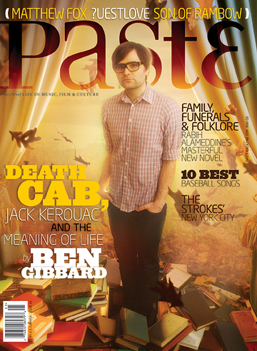
I chose the magazine Paste to model my cover after because I like the overall composition of the image and text and how they all work together. I also like the variety of fonts used, it adds a lot of viewer interest and typographical diversity that isn't always common on magazine covers. The alignment of the article titles are also different and unexpected, like the left justified text in the right most column. I'm not sure if I would be able to pull it off, but it is a good source of inspiration.
Matthew's Magazine Style

I chose this magazine cover because it has similar ideas that I would like to incorporate into my cover. The arrangement of the furniture is also related to the cover line topics as they are not all in a straight line but rotated. Kind of a fun idea. The one thing I like the best is the placement of the magazine name. I like how most of these covers from this magazine have a white background with the title block and then a picture of some sort right beneath it.
Monday, October 25, 2010
Terri's Magazine Style

Kayla's Magazine Inspiration

I chose this magazine cover not only because it incorporates similar topics as my magazine will (women, business & fashion) but I also really like the mainly left justified style. I also like the full picture taking up the entire cover and the variety in the text size and color. For my magazine I plan to keep the headlines organized and simple, not overlapping the main subject of the picture. I think the colors and the way this cover is laid out overall is very attractive for the fashion aspect of my magazine, but the organized structure of the text will appeal to the business aspect.
Sam's Similar Magazine Style

My magazine I think will end up looking similar to In Style magazine. I like the bold title block and band of color across the top of the magazine. I also plan on using san serif fonts, since a family/kids magazine is less formal. I want to overall keep my magazine fairly simply and not too busy, since the images themselves seem to have a lot going on. There is a focus on kids, crafts, cooking, and other smaller details in the pictures that might get lost if there is too much else going on in the layout, text, etc.
Lizz's Similar Magazine Style

Tuesday, October 19, 2010
Bailey's Cause Borders
I used many borders for my poster, mainly in the nutrition label. The meat package has a 1.25"x1" border. The text outside of the packaging is centered, leaving a 5"x.5" border for the top and 1"x.5" border on the bottom. For the nutrition label, I followed FDA regulations from this website
http://www.fda.gov/Food/GuidanceComplianceRegulatoryInformation/GuidanceDocuments/FoodLabelingNutrition/FoodLabelingGuide/ucm064904.htm
Overall, I wanted to give a straightforward appearance to the poster, so that directed my borders.
http://www.fda.gov/Food/GuidanceComplianceRegulatoryInformation/GuidanceDocuments/FoodLabelingNutrition/FoodLabelingGuide/ucm064904.htm
Overall, I wanted to give a straightforward appearance to the poster, so that directed my borders.
Sarah's Cause Poster

I chose to utilize a border around my poster in respect to the text, but not the image. The border is not consistent on each side because I felt the larger text toward the top was too heavy and would create tension when placed as close to the edge as the smaller website text in the bottom right. I suppose it isn't exactly a border then, but more of a use of space. I feel my border?/use of space is successful because it keeps the viewer's eye within the frame of the poster and does not lead them outside of the constraints.
Matthew's Poster border

I chose not to use a border because of the background I used. I modified the background to represent a forrest that is green and lush and a body of water in the lower half. As recycling reflects more than just one specific contained area, adding the border would feel like it was closing it off. In promoting recycling in my poster, having no borders also represents recycling should also not be contained in certain areas but everywhere.
Monday, October 18, 2010
Connor's Poster- Borders?

For my poster I chose to bleed the images to the edges rather than creating a border to contain the image. Instead of using a border to contain the elements of the poster I opted to use the blue shapes to frame the content. In addition to those shapes I also kept a margin of about .25" from the edge of the poster to maintain a uniform appearance within a gridded organizational strategy.
Liz's Poster border

I chose not to give my poster a border but instead to make the image (ripples in the water) seem to extend outside of the poster and appear to expand forever. All of my text is well away from the sides of my poster. While my poster does not follow the “Z” pattern, it leads the viewer’s eye down the poster because I created it in the “tombstone” format. I don’t think having a border would benefit my poster. If anything, having the white border takes away from the intensity of the yellow background and bright orange water. And it will also make the images as well as text seem to centered.
Andrea's Poster Borders

I did not put a border around my poster, instead choosing to allow the photos to bleed to the edge. I did make sure my text was within a half-inch from the edge of the poster so it was easier to read. This creates the illusion of a boarder in the lower third of the poster.
Sunday, October 17, 2010
Lizz's Poster Borders

On my poster, I used a small border around the entire edge. The edge of the quotation mark on the top matched up with the edge of the magenta text towards to bottom to create a unified border on the right. Everything on the bottom of the poster is about a half inch from the bottom, with the "logo" pushed up a little further to help balance out the heavy left side with some extra space. The border along the right side is smaller then the one on the left, but still pushes the text away from the edge. Along the top, the text is about an inch down from the top, with the bounding shape coming almost to the edge of the poster to add some tension and to draw attention to the text.
Terri's Poster Borders

The poster is also split up into a grid, that isn't totally even, but "recycle" and "energy" split the page into three different sections. The viewers' eyes can follow the "Z" formation across the poster. First by reading the top of the page from left to right where it has "environment" and then follow the scrabble letters from the top right, diagonally down to the left, and eventually the eyes will meet with the text at the bottom. The tree stump is a sort of "V" formation to the bottom, which also leads the eye to the text at the bottom.
Carolina: Border

My poster creates a visual border (though there is not actually one there) throught the placement of type and objects near the border. For example, the light post, which lines up with the type below it is about a half inch from the edge of the page. The type at the top is following the same pattern. Though most of the images (the streetlight, the blue box, the background itself) bleed off the page, the type standing a safe distance away creates that border.
The words 'Why Drive?' don't follow the existing border pattern, but because most of the x heights on the letters do, they are percieved to be continuing the border.
Thursday, October 14, 2010
Allison: Border

Megan's Grid Poster

Wednesday, October 13, 2010
Kayla's Poster
My poster didn't utilize an obvious, outlined boarder. In my revisions I worked to move my text around to include it inside the transparent blue strip across the bottom, leaving some room all the way around as an "invisible boarder" to contain the text. Also looking at the poster as a whole, though the smoke at the top is somewhat, "left wandering into the world" as Tony put it, the entire image is on the page and nothing is cropped out, again, implying a boarder by leaving some space so the viewer knows where the poster ends.
SAM: Cause Poster
My poster for diabetes awareness uses a grid format in its design. Although I didn’t use the classic “Z” formation for the most part in terms of where I placed the text in my image, I feel that the layout of my design still moves the viewer from one area of the image to the next. The viewer is drawn in to the highly saturated and visually appealing vegetables, which leaves them wondering “unite for what?”. Which then leads you to the text, first asking a question, answering the question, and leaving the viewer with somewhere to go for more information.
In terms of how I used a grid in my poster, The “unite” image takes up two-thirds (vertically) and the green information bar takes up the last third. The informational text is also aligned on a horizontal grid with the vegetables (top of the pea pods, bottom of the carrots). I also left a ½” border around the entire poster to contain the image.
MARI: Cause Poster

My poster for our second assignment uses a grid layout - but minimally. All of my text is centered around the apple to give order to the layout. The syringes act as arrows, point toward the apple and directing the eye to the focal point of the poster. The apple is where the message lies; first we interpret that message based on the image. 'What could syringes stuck in an apple possibly mean? Oh, there are unhealthy chemicals being forced into the food' etc. Then as the eye travels down, this interpretation is reinforced by the big text "Do you know what's in your food?" The rest of the text is additional info about the cause: a quote describing the concern of today's food industry, followed by a supporting organization and how to contact them for even more info. The bottommost line of text with the contact info finishes the grid layout with a hint of the classic Z formation. Our eyes travel down and to the left, then reading the line to the right (picking up info along the way).
Overall I kept the poster clean and simple, and used highly saturated colors in order to give it a very manufactured, almost cold-laboratory feel. Very fake and very unnatural - communicating the unnatural customization of much of our foods today.
Tuesday, October 12, 2010
Linda's Grid Poster.
This poster is used with grids. The title of the event is placed largely and centered at the top. There are two columns that makes up the information. The one on the left is more descriptive with a paragraph because it explains what the even is. The column on the right is more of the schedule and is outlined.


Justin's grid poster
This is a poster for the Quebec Metal Fest 9. it consists of a main image on top, then two columns going down consisting of the bands playing on certain days. Ending with another a centered group of text with the sponsors split up back in to the two columns.

Sam's Grid Poster

Liz's Grid poster
This poster is definitely very grid-like. It contains multiple boxes of pictures that leads the viewers eyes down and back each row of pictures and eventually towards the title of the poster. While this is not an obvious z shape layout, it does possess some qualities of one. You start out by reading the word “childhood” then scroll through the boxes of pictures underneath and eventually they lead you to “OBESITY” in very large red letters, and then towards the facts and other information underneath it.

-Liz Qi
Matt's Grid Poster

Sarah's Grid Poster

This poster is good example of the grid format. There seems to be 4 columns, demonstrated by the 4 sections of text along the bottom of the poster. The text toward the top, for the most part, also stays within these constraints. The text inside each of these columns is left aligned. Multiple horizontal rows, though less important than vertical columns, are also obvious.
Monday, October 11, 2010
Terri's Poster

Subscribe to:
Comments (Atom)